Employment at the end of the First Quarter of 2010
On the first Friday of each month, the Bureau of Labor Statistics of the U.S. Department of Labor Statistics issues the Employment Situation Report. As described at Investopedia ( http://www.bls.gov/news.release/empsit.nr0.htm), this report, " . . . also known as the Labor Report, is an extremely broad-based indicator . . . " Data from two separate survey go into this report: 1. The first, the "establishment survey" , is a sampling of more than 400,000 businesses across the country, covering about one-third of all non-farm workers nationwide, and presents statistics concerning non-farm payrolls and hourly earnings.
2. The second survey, referred to as the "household survey", measures results from more than 60,000 households and produces a figure representing the total number of individuals out of work, and from that the national unemployment rate . The data is complied by the U.S. Census Bureu with the help of the Bureau of Labor Statistics.
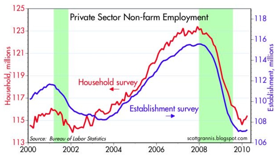
 Scott Grannis (the Calafia Beach Pundit -- http://scottgrannis.blogspot.com/) provided the graph copied above. It shows both the data from establishment survey and from the household survey. Grannis point out that the latter measure (the red line in the chart above) has a good record over the years of picking up turning points in the economy. This is due to the fact that it is based on a very current telephone survey. The former measure is based on data obtained from existing business to which the government statisticians add an estimate of how many new firms might have been recently established. When the economy is just entering and upward turn, is is reasonablbe to expect that these statisticians will underestimate the number of new business and new workers. (Both lines represent private sector workers only.) The fact that the household data shows an upward tick is a hopeful sign.
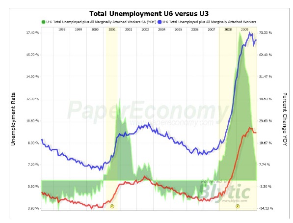
Looking at the unemployment rate, as reflected in the chart above, the picture is a less encouraging. This chart, courtesy of "Sold-at-the-Top" (www.papereconomy.com), shows both the traditional unemployment rate--the "U3 rate" (inred)-- and the "U6 rate", which includes “marginally attached” workers (including discouraged workers) and persons who have settled for part time employment to be “underutilized” labor. The "real" unemployment rate should include this larger group, rather than the smaller and more restrictive “unemployed” group that is used for the "official" unemployment rate. And, unfortuantely the line that shows this rate (the "blue line" in the chart above) reflects a recent uptick.
