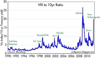
On August 8, 2011, the Calafia Beach Pundit (aka Scott Grannis) posted a fascinating chart at his blog. It plots the ratio of the VIX to the yield of ten-year notes issued by the U.S. Department of the Treasury between 1990 and early August 2011.

According to a Wikipedia article about the VIX, it is the ticker symbol for the Chicago Board Options Exchange Market Volatility Index, a measure of the volatility of S&P 500 index. Often referred to as the fear index or the fear gauge, it represents one measure of the market's expectation of stock market volatility over the next 30-day period. The VIX Index was introduced by Prof. Robert Whaley in 1993 while he was at Duke University.
Mr. Grannis notes that the Vix index has only been higher twice in history: during the peak of the Lehman crisis/financial panic in Oct. '08, and during the great market crash of Oct. '87. The combination of a very high Vix (panic) and a very low Treasury yield (recession/depression fears) has only been worse during the Lehman/financial crisis. He suggest that, "This might not be the exact bottom, but we must be getting pretty close."
I am unclear as to whether the Calafia Beach Pundit is referring to the bottom of the stock market cycle or the climb out of the Great Recession. But it is interesting to see how this ratio has varied over the past two decades. One thing is for sure, the heights of volatility reached in 2008 and 2011 are far above those reached in prior years. This ratio seems to portray perfectly what people mean when they say the stock market seems like a roller coaster.