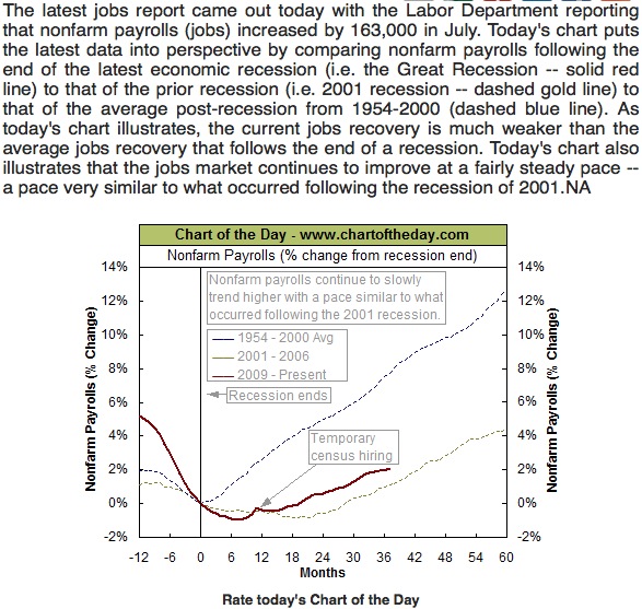
The folks at Chart-of-the-Day have created (on August 3, 2012) another great graphic display that compares where we are in the recovery of jobs following the Great Recession with average job recovery of all recessions since 1954 and the jobs recovery following the 2001 Technology Bubble Recession. Our current jobs recovery since the end of the Great Recession in June 2009 is similar to that of the recovery of the early 2000s but much slower than the average jobs recovery since the mid 1950s.
