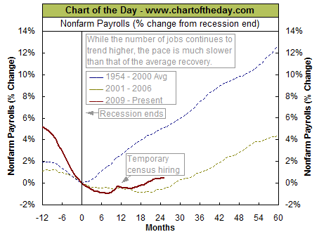
The folks at Chart of the Day have posted a chart that puts jobs data into perspective by comparing nonfarm payrolls following the end of the Great Recession (solid red line) to that of the 2001 recession (dashed gold line) to that of the average post-recession from 1954-2000 (dashed blue line). The current jobs recovery is much weaker than the average jobs recovery that follows the end of a recession. The chart also illustrates that the post-Great Recession jobs recovery is somewhat similar and (as of mid 2011) slightly stronger than what occurred following the recession of 2001.
